Table of Contents:
NOTE: The Report Generator produces reports from templates created by the user; Therefore, you MUST have a template created before producing a report with the Report Generator. To be present in a report, a widget must:
- Exist in a report template, or it can be
- Added to a report while being created with the Report Generator
See these articles for the following related instructions:
Data points and objects are essential components of any IR Widget that displays data. Make sure to understand how they play a role in data visualization from this article:
Summary
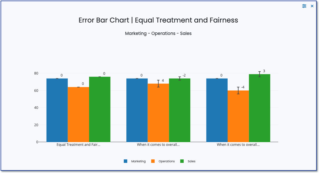
Error Bar Charts serve as a valuable visual aid for data analysis, providing a straightforward method to illustrate the reliability and variability of data points. By incorporating vertical or horizontal lines (error bars) into each data point on a chart, they represent the margin of error or the expected range in which the true value lies.
This is essential for grasping the accuracy of measurements or estimates, as it showcases the possible range of variation or uncertainty linked to each data point. By including error bars, you can effectively compare various datasets and evaluate their coherence or variability.
Purpose
Indicating Data Reliability
- Visualizing Variability: Shows the range within which the true value is expected to lie, offering a visual representation of the data's reliability or precision.
- Highlighting Uncertainty: Error bars help in understanding the degree of uncertainty associated with survey responses, especially when dealing with estimates or samples.
Enhancing Data Interpretation
- Comparing Groups: Facilitates the comparison between different groups or categories within the survey data by visually representing the overlap or distinctness in their error margins.
- Assessing Significance: Helps in assessing whether differences between survey responses are statistically significant or if they might be due to sampling variability.
Improving Report Quality
- Adding Depth to Analysis: Incorporating error bars in survey data reports adds a layer of analytical depth, moving beyond mere point estimates to consider the range of possible values.
- Enhancing Credibility: By acknowledging and visually presenting the uncertainty or variability in the data, reports gain credibility and transparency, fostering trust in the findings.
Supporting Informed Decision-Making
- Guiding Decisions: Understanding the variability and confidence levels in survey data assists stakeholders in making more informed decisions, acknowledging the precision of the data.
- Prioritizing Areas for Further Investigation: Areas with high variability or uncertainty may highlight the need for further investigation or data collection.
Setup
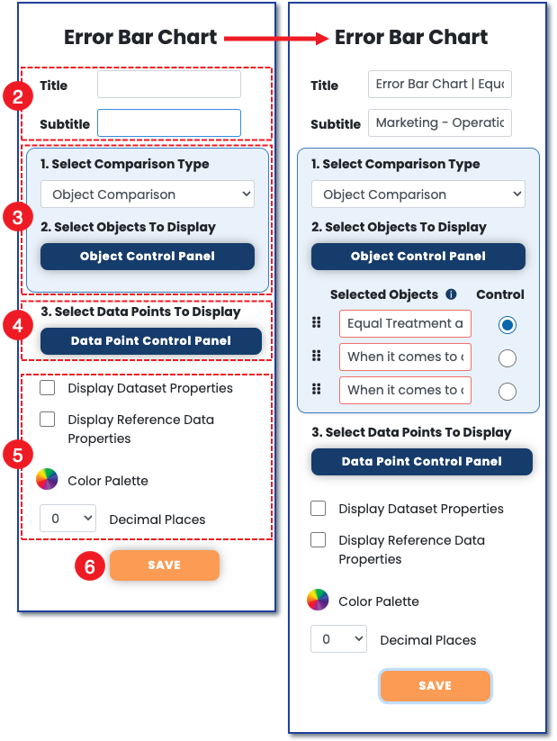
1) To set up the error bar chart, click the control panel icon to open the widget control panel.
 2) Once the control panel opens, add a title and subtitle to the target chart. Either can be made relevant to the section of the survey the chart is reporting on.
3) Select to compare either objects or data points. Make sure to choose a control so the errors can populate on the other graphs.
4) Once an item is selected in #3, the opposite presents in #4.
5) Choose additional display preferences.
6) Save your settings.