Table of Contents:
NOTE: The Report Generator produces reports from templates created by the user; Therefore, you MUST have a template created before producing a report with the Report Generator. To be present in a report, a widget must:
- Exist in a report template, or it can be
- Added to a report while being created with the Report Generator
See these articles for the following related instructions:
Data points and objects are essential components of any IR Widget that displays data. Make sure to understand how they play a role in data visualization from this article:
Summary
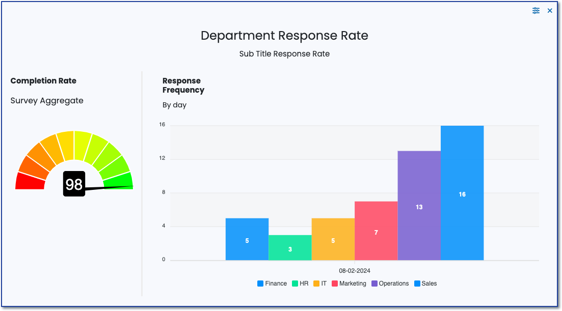
The response rate chart is a powerful tool in survey data reports for visualizing engagement over time, evaluating the effectiveness of data collection strategies, and providing actionable insights to improve future surveys. It enhances the depth of analysis in the report and improves its usefulness in making informed decisions and strategic plans.
Purpose
Monitoring Engagement
- Tracking Participation: Allows for monitoring how engaged participants are over the duration of the survey period, highlighting any trends in participation, such as spikes or drops in response rates.
Evaluating Data Collection Efficacy
- Assessing Method Effectiveness: Helps to evaluate the effectiveness of different data collection methods or strategies implemented throughout the survey period. This can indicate what tactics are most successful in encouraging participation.
Identifying Patterns and Anomalies
- Spotting Temporal Trends: Reveals temporal patterns in response rates, such as particular times of day, days of the week, or periods within the collection phase that see higher or lower participation.
- Detecting Anomalies: Identifies any anomalies in response rates, which could signal issues with the survey process or external factors affecting participation.
Improving Survey Design and Implementation
- Guiding Adjustments: Insights from the chart can guide real-time adjustments to improve response rates, such as changing outreach methods or extending the survey period.
- Informing Future Surveys: Learnings from the analysis of response rates over time can inform the design and timing of future surveys, optimizing for higher engagement.
Enhancing Report Insights and Credibility
- Supporting Comprehensive Analysis: Incorporating response rate trends adds depth to the survey report, providing a fuller picture of the survey's context and methodology.
- Building Trust in Data: Demonstrating an awareness and analysis of response rates can enhance the credibility of the survey findings, as it shows diligence in monitoring and understanding participant engagement.
Decision-Making and Strategic Planning
- Facilitating Strategic Decisions: Understanding when and how participants are more likely to respond can aid in strategic planning for future data collection efforts, optimizing schedules, and communication strategies to maximize response rates.
Setup
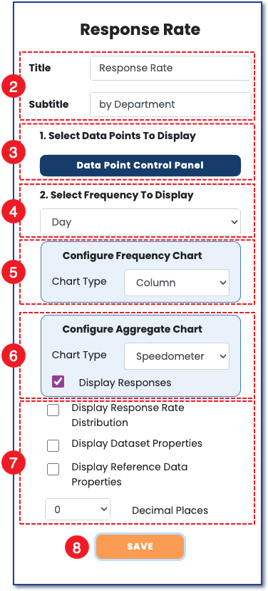
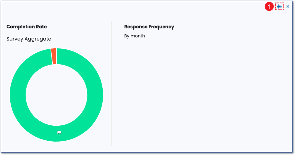
1) To set up the response rate chart, click the control panel icon to open the widget control panel.
 2) Once the control panel opens, add a title and subtitle to the target chart. Either can be relevant to the survey section the chart is reporting on.
3) Select which data points to display.
4) Select day, week, or month as the frequency to display.
5) Choose a line, column, or bar chart to visualize the frequency.
6) Choose a donut, progress, or speedometer to visualize the total response rate.
7) Choose additional display preferences.
8) Save your settings.