.png?height=120&name=Profile%20Blue(2).png)
The Analytics menu is where you become a data scientist, but without having to do the math! Conduct data analysis with ease using built in data visualization, and the filter and comparison tools.
From the Analytics menu, create and view charts of your survey data and view response statistics to the demographic questions. Metolius offers versatile analytics, enabling comparisons between participants, departments, outcomes, intentions, and questions. Easily filter by demographic data and save benchmarks with just a few clicks, eliminating the need for manual data processing.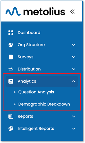

Question Analysis
Visualize survey response data using customizable charts and crosstabs at various levels, including Aggregate, Outcome, Intention, and Question. Additionally, you can utilize drill-down charting, which presents each analytic question in its own distinct chart. Filter data based on demographic responses and make comparisons across participants, departments, or even managers, provided you have an Enterprise subscription. Save filtered subsets and benchmarks for further analysis of notable findings. Furthermore, you can adjust the chart's scale, choose the chart type and colors, modify the data label's color, position, and font size, as well as determine the placement of the legend—all directly within the chart interface.
Demographic Breakdown
Explore individual charts corresponding to each demographic question, effectively showcasing the statistical data associated to that question. You have the flexibility to display all questions, one, or a select few. Various chart display options are available, including column, bar, scatter, pie, doughnut, or stacked bar formats. You can opt to present all charts in a uniform style or customize each one differently. Additionally, filter your results by Department, or by Manager if you hold an Enterprise subscription. Generate a report or download your data in formats such as .csv, .png, or .svg for further analysis.