.png?height=120&name=Profile%20Blue(2).png)
This article explains how to use the Demographic Trend Analysis feature for analyzing demographic data in surveys, including visual representations of statistics, customizable chart types, and exporting options for data analysis.
The Demographic Trend Analysis option, located under the Analytics menu, offers a visual representation of the survey's statistical data from the questions posed to the participant in the Demographic Question block. This block is activated in the assessment attributes. See this article on setting up the Dynamic Filter Question block (AKA User Demographics).
Each question is paired with a corresponding chart; Each response option is represented in both the legend and in the chart with either a percentage or numerical value depending on which chart type you choose.
Demographic Trend Analysis (DTA)
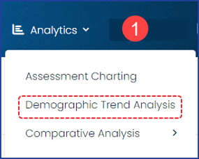
1) On the main navigation bar, click on Analytics and choose Demographic Trend Analysis
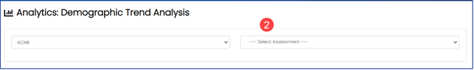
2) At the top of the DTA page, choose the survey you wish to view. Only surveys that are published and actively receiving responses will be available in the dropdown list.
3) Once selected, your survey questions will populate with a corresponding graph, one for each question. A pie chart with a legend at the bottom is the default chart type.
The green print button will print all charts in a display format showing the questions, charts, and legends and leaving out the chart display options, etc. You can also use the print option to save it as a PDF.
The blue Export button will download the data in spreadsheet format as an Excel file.
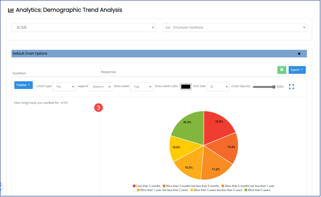
Above each graph you will see a row of display options for adjusting the following attributes:
- Color palette
- Chart type
- Legend location
- Data label location, color, and font size
- The opacity of the color palette
 Chart Display Options
The charts below represent the same questions with the same data but are displayed using a different chart type:
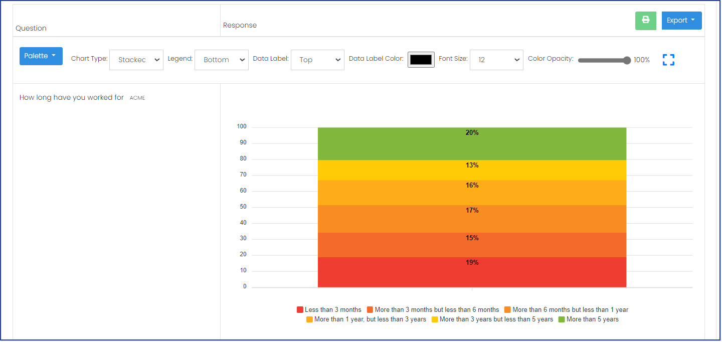 Chart Type - Stacked
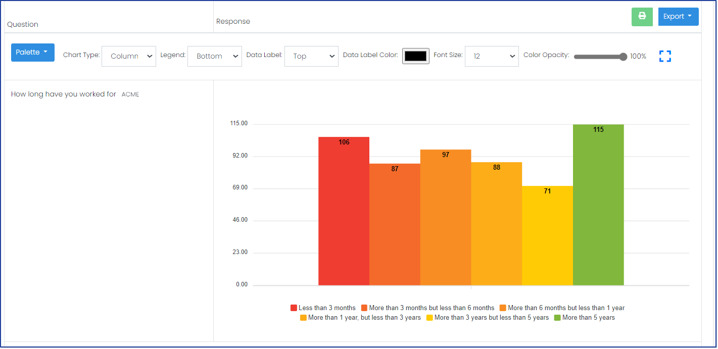 Chart Type - Column
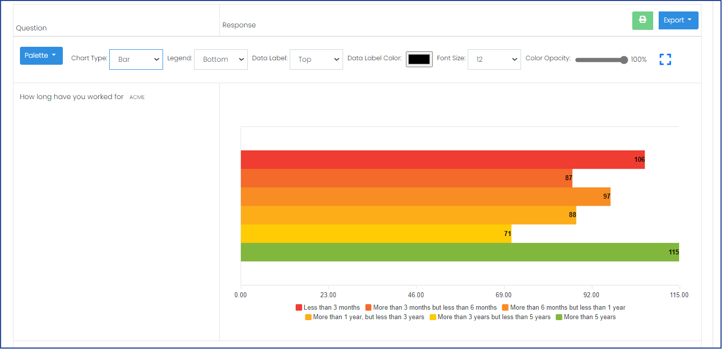 Chart Type - Bar