
Metolius surveys can gather information without assigning a score to the participant response. This feature allows the survey creator to include questions relevant to the goal but otherwise do not impact the calculation of the overall score.
The charts that provide this statistical data are accessed from the Analytics chart. Each question is paired with a corresponding chart; Each response option is represented in both the legend and in the chart with either a percentage or numerical value depending on which chart type you choose.
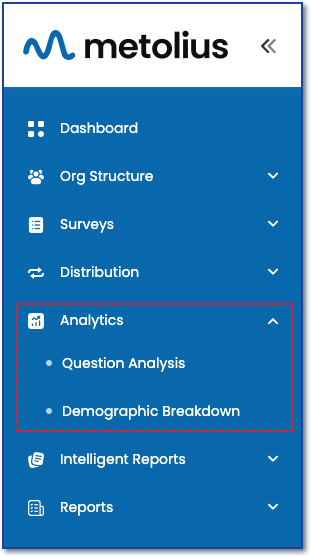
Accessing Analytics
The first step to visualizing any of your survey data is to choose the survey you wish to analyze.
To access data analytics, first expand the Analytics menu in the main navigation sidebar.
For information gathering questions, choose the Question Analysis submenu.
OPTIONS FOR DATA ANALYSIS
See the following articles for more information on understanding the three question categories for data analysis and how to access Question Analysis for Data Analytic and Demographic question categories.
See Understanding the Question Analysis Framework and Analytic Controls: How to Use Filter and Compare for Data Analysis for a deep dive into all the options and Analytic controls within Question Analysis. This article focuses solely on analysis of the the Data Analytic questions.
Information Gathering Question Analysis
After selecting the Question Analysis submenu you will be brought to the Question Analysis page.
Survey Selection - Choose an option from the Company Name dropdown menu if on the Enterprise subscription plan, all other plans will have the company pre-populated.A chart for each question present underneath the analytic controls.
- Palette - The color palate for the data elements (bars, columns, pie slice, etc)
- Chart type - Bar, Column, Donut, Pie, Scattered, Stacked.
- Legend - Location at bottom, left side, right side, or keep hidden
- Switch Axis - Determine the chart orientation
- Data Label - location, color, and font size
- Color Opacity - Controls opacity of the chart color.
- Chart options - Same options as above, but this control changes the attributes of all charts to be the same.
- View Questions - A pop-up dialog box pops up to display all the questions in spreadsheet format.
- Reports - Save a report that reflects what you have shown on the page. See this article for more info.
- Significant Difference - This statistical measure, primarily related to filtered data, helps us figure out if the differences we observe between two or more groups are real or just due to chance. It's important to understand this concept when analyzing survey results and comparing responses across different demographics, timeframes, or conditions. By using this measure, we can draw more accurate conclusions from our data.