Table of Contents
NOTE: The Report Generator produces reports from templates created by the user; Therefore, you MUST have a template created before producing a report with the Report Generator. To be present in a report, a widget must:
- Exist in a report template, or it can be
- Added to a report while being created with the Report Generator
See these articles for the following related instructions:
Data points and objects are essential components of any IR Widget that displays data. Make sure to understand how they play a role in data visualization from this article:
Summary
The Tornado Chart serves as a specialized tool designed for sensitivity or comparative analysis, primarily in scenarios requiring the evaluation of the impact of different variables on a specific outcome. Tornado charts are so named because of their distinctive shape, which resembles a tornado—wide at the top and tapering toward the bottom. This visualization is beneficial in decision analysis, risk management, and financial forecasting, among other areas.
Purpose
Highlighting Variable Impacts
- Sensitivity Analysis: Tornado charts are highly effective in displaying the impact of input variables on the final result. They are crucial in sensitivity analysis, which helps guide strategic decisions by understanding how different factors affect the outcome.
- Comparative Impact: Tornado charts simplify the comparison of variables by displaying them side by side in descending order of impact, highlighting the most and least influential factors.
Supporting Decision-Making
- Informed Decisions: The visual comparison provided by tornado charts helps decision-makers understand which factors warrant closer attention or resource allocation, facilitating more informed and strategic choices.
- Risk Management: In risk assessment, tornado charts can identify and prioritize risks based on their potential impact on project outcomes or objectives, helping teams to focus on mitigating the most critical risks.
Enhancing Report Clarity and Engagement
- Clarity of Presentation: Tornado charts offer a clear and concise way to present complex information, making it easier for the audience to grasp the significance of the data without getting overwhelmed by details.
- Engagement: The unique and visually striking appearance of tornado charts can engage readers and encourage them to explore the data more deeply and retain the information presented.
Facilitating Scenario Analysis
- Scenario Planning: Tornado charts are effective in scenario analysis, allowing organizations to visualize how different scenarios (best case, worst case, most likely case) can impact their outcomes, aiding in strategic planning and preparedness.
Streamlining Communication
- Efficient Communication: By summarizing the effects of multiple variables in a single chart, tornado charts can streamline the communication of complex analyses, making it easier to convey findings to stakeholders without a technical background.
Customization and Adaptability
- Customizable Visuals: The Tornado Chart widget can typically be customized to match report themes or organizational branding, including adjustments to colors, labels, and scale, enhancing the professional appearance of the report.
- Versatility: While particularly favored in financial analysis and risk management, tornado charts are versatile enough to be applied in various fields, including marketing, project management, and environmental studies.
The Tornado Chart is a tool that helps communicate the relative importance or impact of different variables on a particular outcome. It visually prioritizes the factors based on their influence, making it an invaluable tool for strategic planning and decision-making. Its ability to show the relative importance of each factor helps in understanding and identifying the most significant variables that affect the outcome.
Setup
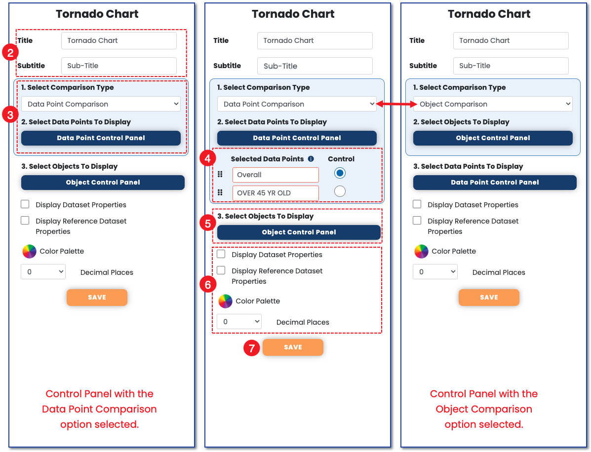
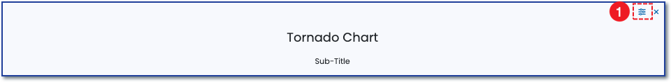
1) To set up the tornado chart, click the icon in the top right to open the chart control panel.
 2) Add a title and subtitle to the chart.
3) Next, choose what to compare by selecting either data point or object from the "Select Comparison Type" dropdown. Click the corresponding button on the control panel to select two items for display comparison.
In the example below, referring to the two left control panels, we have chosen a data point comparison. The two data points we chose to display are the survey's overall score compared to survey participants who self-identified as 45 years and older.
Tornado charts compare either two data points to each other across several objects, or two objects to each other across several data points. The third control panel far right, has object chosen as its comparison type. The double-sided arrow shows the difference between the two. When you choose either data point or object from the "Select Comparison Type" dropdown, the other will reposition to item number three in the control panel.
See this article to understand the difference between data points and objects and how to use them among the chart widgets.
4) Select which data point to mark as the control.
5) Continuing with the example, use the object control panel to select the objects to display in which the two data points will be compared.
6) Choose additional visualization options, including the chart colors and decimal points the data label should reflect.
7) Click Save to have the chart reflect the data selected.