Table of Contents:
NOTE: The Report Generator produces reports from templates created by the user; Therefore, you MUST have a template created before producing a report with the Report Generator. To be present in a report, a widget must:
- Exist in a report template, or it can be
- Added to a report while being created with the Report Generator
See these articles for the following related instructions:
Data points and objects are essential components of any IR Widget that displays data. Make sure to understand how they play a role in data visualization from this article:
Summary
A Favorability Index is a versatile tool that serves multiple purposes, from measuring sentiment and identifying trends to simplifying data presentation and informing strategic decisions. Its ability to condense a wealth of opinion data into a single, digestible format makes it an indispensable resource in fields ranging from marketing to public policy. To configure this chart, utilize the IR widget control panel to establish the index parameters and then link them to the relevant response options.
Purpose
The Favorability Index Chart is a valuable analytical tool often used in survey research, marketing analysis, and public opinion tracking. Its primary purpose is to provide a clear, visual representation of how favorable or unfavorable a particular product, service, brand, public figure, or policy is among a specific audience or the general public. Compiling responses from a set of questions or statements into a single index simplifies complex data into an accessible format that can be easily understood and acted upon. Here's a deeper dive into the purpose and utility of a Favorability Index Chart:
1. Measuring Overall Sentiment
The chart aggregates individual sentiments towards the subject comprehensively showing the overall favorability. This is particularly useful for quickly gauging public opinion or customer satisfaction levels.
2. Comparative Analysis
It enables comparisons over time or between different subjects. For example, a brand could use it to compare its favorability against competitors or track changes in public perception following a marketing campaign.
3. Identifying Trends and Patterns
Analyzing favorability index charts over multiple periods makes it possible to identify trends and patterns in public opinion. This can inform strategic decisions, such as adjusting marketing strategies, addressing public concerns, or capitalizing on growing popularity.
4. Simplifying Complex Data
Survey data can be complex, especially when it includes wide-ranging opinions. A favorability index chart distills this data into a single, comprehensible metric, making it easier for stakeholders to understand and make informed decisions.
5. Enhancing Communication
The visual nature of the chart makes it an effective communication tool. It can be included in reports, presentations, or dashboards to convey key insights about favorability to stakeholders, decision-makers, or the public engagingly and straightforwardly.
6. Supporting Strategic Planning
Understanding how favorable your audience views a product, service, or brand can be crucial in strategic planning. This insight helps prioritize areas for improvement, investment, or further research and development.
7. Benchmarking Performance
Favorability indexes can serve as benchmarks for measuring performance against industry standards or past performance. This can be crucial for setting realistic goals and evaluating progress toward achieving them.
In summary, the Favorability Index Chart is a versatile tool that serves multiple purposes, from measuring sentiment and identifying trends to simplifying data presentation and informing strategic decisions. Its ability to condense a wealth of opinion data into a single, digestible format makes it an indispensable resource in fields ranging from marketing to public policy.
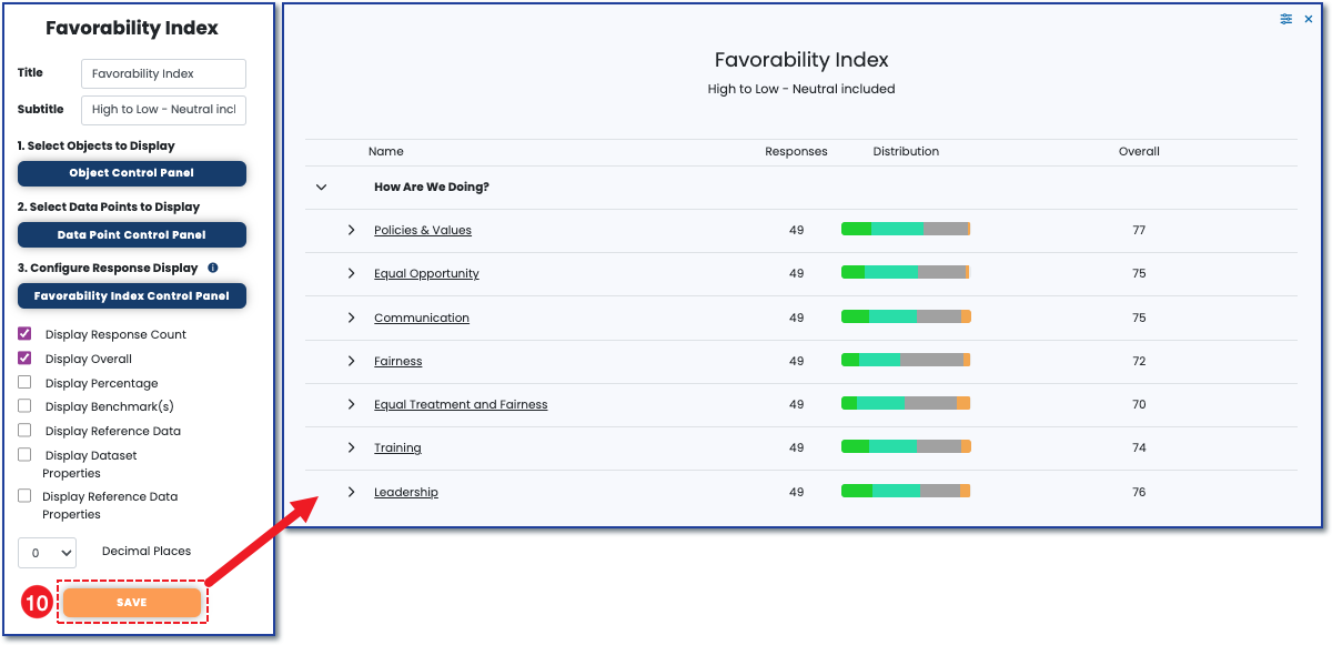
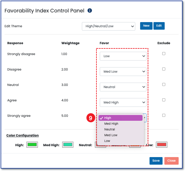
With the IR favorability index chart (see image below) you can assign a favorability theme to the surveys' Likert response options and apply these themes to different survey sections.
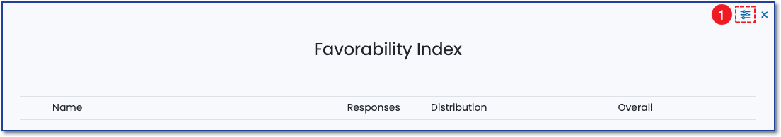
1) To set up the Favorability Index chart, click the control panel icon to open the widget control panel.
 2) When the widget control panel appears, click the Favorability Index Control panel button to open the control panel.
![]() 3) Click on New to add a new Theme.
3) Click on New to add a new Theme.
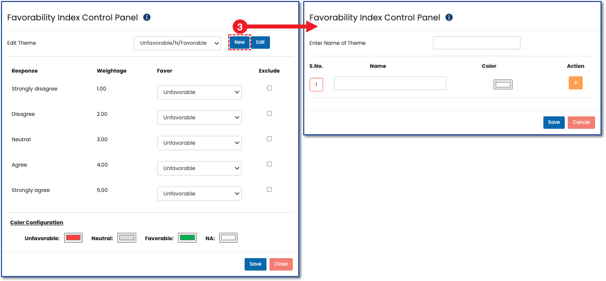
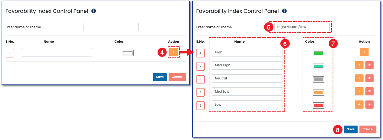
4) Click the Plus button under the Action column to add new categories to your theme.
5) Name the theme at the top.
6) Name the categories.
7) Assign corresponding colors to each category by clicking inside the color box.
8) Click Save at the bottom.
9) After selecting your theme at the top, link your theme's favorability categories to the Likert Response options that you want them to represent in the chart. Choose to exclude a Response from the Favorability Index chart by checking the box associated with it under the Exclude column.
10) Make sure to click Save from the control panel to see the changes in the Favorability Chart.